Dual Coding Theory in Education: Making Visuals and Narration Work
Pairing words with pictures helps people learn, but only when the picture carries meaning and the words arrive with it. Most course videos get the pairing wrong in one of three predictable ways.
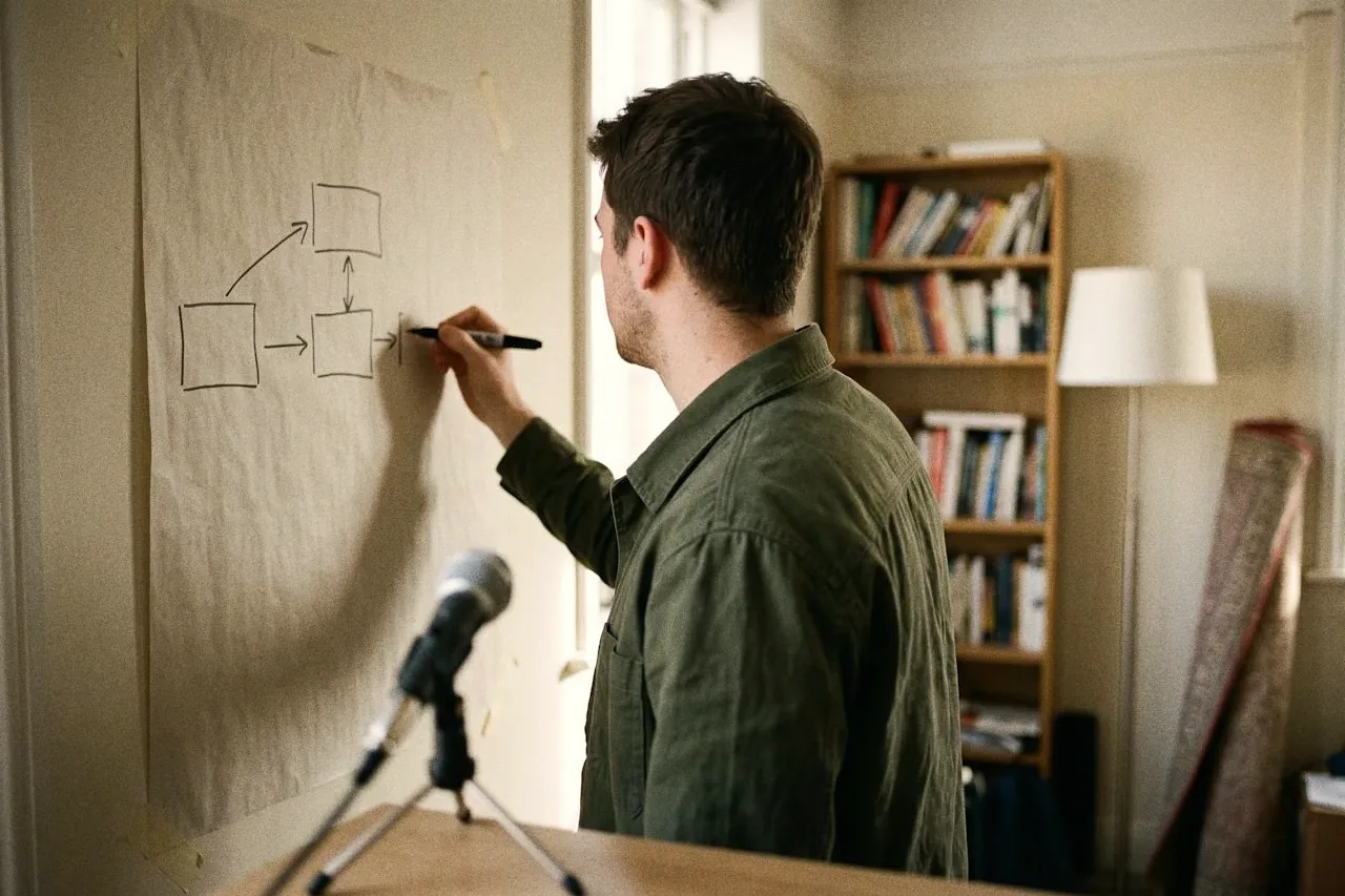
Dual coding theory says people process words and images in two connected systems, so information presented in both forms is easier to understand and remember. For course design, that means explaining a meaningful picture with narration at the same moment, keeping on-screen text to key terms, and cutting decorative images that add nothing.
Key takeaways
- Dual coding theory, developed by Allan Paivio, holds that the mind has separate but linked systems for verbal and non-verbal information, and that material coded in both is remembered better.
- In Richard Mayer's summary of his group's experiments, people learned better from words and pictures than from words alone, the largest effect among his design principles.
- Adding printed text that repeats the narration over a picture didn't help in Mayer's tests; a meta-analysis found on-screen key terms worked better than full verbatim text.
- Dual coding is not learning styles: it adds a complementary picture for every learner rather than matching instruction to a preferred modality.
- A picture only counts if it carries the idea; decorative stock images and talking-head footage add load without adding a second code.
Most online courses already use words and pictures together. There’s a narrated video, a slide deck, a diagram in the workbook. So it’s easy to assume dual coding is something you’re doing by default. Usually you’re doing half of it, and the other half goes wrong in one of three ways: the picture is decoration rather than content, the script is printed on screen under it, or the words and the picture arrive at different moments.
Dual coding is the idea that people learn better when an explanation comes in two forms at once: words, and a picture that shows the same thing. The research behind it is decades old and reasonably solid. What the popular versions leave out is the part that matters most when you record a lesson: which pictures count, what to do with on-screen text, and when the words should arrive. This entry covers what the evidence says, how to apply it to course video, and what to check in your platform.
What the research says
Two systems, linked
Dual coding theory comes from the Canadian psychologist Allan Paivio. Its most useful statement for educators is a long review he wrote with James Clark, which describes “nonverbal and verbal mental systems that are specialized for the processing of imagery and linguistic information” (Clark & Paivio, 1991). The verbal system handles language in any form: heard, read, spoken. The non-verbal system handles images and other representations that resemble the things they stand for.
The two systems are separate but connected. A word can call up an image, and an image can call up a word. The educational claim follows from that connection. Clark and Paivio summarise the explanation for imagery’s effect on memory as “the additive effect of imagery and verbal codes is better than a verbal code alone”, and report that concrete phrases, sentences and paragraphs are remembered better than abstract text (Clark & Paivio, 1991). They cite an example from reading research: children who listened to stories while looking at relevant pictures recalled more than children who only heard them.
Notice what that claim covers. It isn’t only about putting pictures on slides. Concrete language and examples that evoke an image count too, and the review notes that learners are more likely to form mental images when they’re asked to. A well-chosen analogy in narration is a form of dual coding, even with nothing on screen.
From theory to course design
The person who turned dual coding into design rules for screen-based lessons is the educational psychologist Richard Mayer. His cognitive theory of multimedia learning rests on three assumptions, the first of which he calls dual channels: humans have “separate but interacting channels for processing auditory/verbal information and pictorial/visual information”. Mayer says he incorporated the idea after reading Paivio’s work on dual coding (Mayer, 2024). The other two assumptions are that each channel’s capacity is severely limited, and that meaningful learning depends on the learner actively selecting, organising and integrating the material with what they already know.
From that, Mayer’s group derived what he calls the multimedia principle: people learn better from words and pictures than from words alone. In his 2024 review, Mayer summarises 15 design principles drawn from more than 200 experiments he and his colleagues have run since 1989, with an effect size and number of tests for each (Mayer, 2024). The seven that are about how words and pictures should be combined are below.
Words with pictures beat words alone, with an effect size of 1.35 across 13 tests
Effect sizes Mayer reports for seven design principles about pairing words and pictures, from his research group's experiments · effect size
Read together, they make a clear case. Adding a relevant picture to words had the largest effect of any principle in the table. Presenting the words and the picture at the same time (temporal contiguity) and close together on screen (spatial contiguity) both helped. Explaining a picture with narration rather than on-screen text (modality) helped. Cutting extraneous material (coherence) and adding cues that highlight what matters (signalling) helped.
More text is not more coding
One row in that chart is close to zero. Mayer’s redundancy principle states that people do not learn better when printed text is added to graphics and narration, with an effect size of 0.10 across 12 tests (Mayer, 2024). That runs against a common habit in course video: a diagram, a voice explaining it, and the script printed underneath.
An independent meta-analysis adds useful detail. Adesope and Nesbit pooled 57 studies, mostly with post-secondary students, comparing spoken-only, written-only and spoken-plus-written presentations (Adesope & Nesbit, 2012). Spoken-plus-written beat spoken-only overall, but the advantage showed up for learners with low prior knowledge, for system-paced material, and for material without pictures. And presentations that showed key terms taken from the narration did better than ones showing the full text, accounting for much of the advantage.
So the practical reading is: when there’s a meaningful picture on screen, let the narration explain it and keep on-screen words to labels and key terms. When there’s no picture, or learners can’t control the pace, written support helps more.
Dual coding is not learning styles
Dual coding is often confused with learning styles, the idea that some people are “visual learners” and others “auditory learners”, and that teaching should match each person’s preference. Weinstein, Madan and Sumeracki, in a review of six well-supported learning strategies, note that the evidence doesn’t support learning styles, which have come to be described as a myth within psychology (Weinstein et al., 2018). Dual coding works the other way round.
Every learner gets both forms. Nobody gets a “visual version” of the course.
How strong is the evidence?
Moderate to strong for the core claim, with limits worth knowing. The multimedia principle has a large effect in Mayer’s summary, and the review by Weinstein and colleagues counts dual coding among strategies with robust support from decades of research. But most of Mayer’s evidence comes from one research programme, much of it with university students and short lessons tested soon afterwards. The 2024 review doesn’t define its effect-size column in the table itself, and Mayer stresses that each principle has boundary conditions: for whom, for which lessons and under what circumstances it applies.
Weinstein and colleagues also add two cautions. Each extra representation adds cognitive load and can lead to over-saturation, so pictures must be helpful and relevant. And some popular classroom versions, such as having students replace individual words with pictures, haven’t been tested; they say more research is needed on how dual coding should be implemented (Weinstein et al., 2018). We’d treat the principle as well supported and the specific techniques as worth testing in your own course.
How to apply it in a course
The question to ask of every visual in a lesson is: does this picture show the idea, and do the words about it arrive at the same time and in the same place? Here’s how that plays out when you build a lesson.
We’ll use one example throughout: a lesson in a beginner photography course explaining how aperture, shutter speed and ISO trade off against each other. It’s an invented example, but it’s typical of material that is hard to follow in words alone.
1. Decide what the picture is for
Before you design a slide, write down what the picture has to show. For the photography lesson, it’s a relationship: open the aperture and you must shorten the shutter speed or lower the ISO to keep the same exposure. A simple diagram of three linked dials shows that; a stock photo of a camera doesn’t.
Pictures that carry the idea include diagrams, labelled photos of the real thing, timelines, flowcharts, annotated screenshots and worked examples drawn step by step. Decorative images, mood photos and footage of the presenter talking are not a second code. They may have other uses, such as building rapport, but don’t count them as dual coding.
2. Narrate the picture; don’t caption it
Put the explanation in your voice while the diagram is on screen. Keep on-screen text to the labels on the diagram and one or two key terms (“aperture”, “f-stop”). Resist printing your script under the image. If you work from a script, that script becomes the transcript, not the slide.
3. Make the words arrive with the picture
Temporal contiguity was one of the largest effects in Mayer’s table. In practice, that means the diagram should be on screen while you talk about it, not on the slide before or after. Spatial contiguity means labels sit on or next to the part they name, not in a legend at the bottom.
4. Build the picture as you explain it
Reveal the diagram in the order you explain it: the aperture dial first, then the shutter, then the arrow linking them. Highlight each part as you mention it. This is signalling, and it tells learners where to look at the moment it matters. If you record yourself drawing, as many course creators do on a tablet, you get this for free.
5. Cut what doesn’t carry meaning
Remove background music under explanations, animated transitions, clip art and the camera icon in the corner of every slide. Each competes for the same limited attention the diagram needs. This is the coherence principle, and it connects directly to what cognitive load theory calls extraneous load.
6. Ask learners to make the picture
After the explanation, give learners a short task: sketch the three dials from memory and draw the arrows showing what happens when the aperture opens. Mayer lists drawing an illustration among the generative activities that prompt deeper processing, and it doubles as retrieval practice. A photo of the sketch can be the assignment.
7. Keep it accessible
Captions and transcripts aren’t optional extras: learners who are deaf or hard of hearing need them, and many others use them. The redundancy research is about building full text into the lesson design, not about removing access. Offer captions that learners can switch on, provide a transcript, and write alt text for diagrams that describes the relationship they show, not just “diagram”.
Sometimes on-screen visuals are less about the learning itself and more about the function of good user experience. We found that Canvas put quiz “Start” buttons below the fold on quizzes that included a video, so we had to improvise and create breadcrumbs (buttons and links) to make the journey more seamless. It’s a reminder that you want people spending their cognitive energy on the learning outcomes, not on figuring out how to use a poorly designed course.
This work belongs in the design phase of the ADDIE model, when you storyboard each lesson, before anything is recorded. Pair it with learning objectives so you know which ideas need a picture at all, and use our online course design checklist to check each module before launch.
How the platforms support it
Dual coding is mostly decided before content reaches a platform: in your slides, your diagrams and your recording. Every major course platform will host a narrated video. The differences are in the details around it. We haven’t yet published our reviews of Thinkific, LearnWorlds, Teachable and Kajabi, and features change often, so check these in your platform’s current documentation, on the plan you’re paying for:
- Images and text in the same lesson block. Can you place a diagram with its explanation directly beside or beneath it, rather than on a separate page?
- Captions learners control. Can you upload caption files and transcripts, and can learners switch captions on and off?
- Learner uploads. Can learners submit a photo or file, so a “sketch it from memory” task can be handed in and reviewed?
- Interaction inside video. Can you pause a video for a question or prompt at a set point, rather than splitting the explanation into separate files?
Whatever the platform, the biggest gains come from your own production choices: one meaningful picture at a time, explained in your voice while it’s on screen.
Further reading
- Clark & Paivio (1991), “Dual coding theory and education”. The foundational review of what dual coding means for teaching, from the theory’s originator. Long, and broader than multimedia: it covers concreteness, imagery and memory.
- Mayer (2024), “The past, present, and future of the cognitive theory of multimedia learning”. Mayer’s own account of how his design principles developed, with the table of 15 principles. Open access.
- Weinstein, Madan & Sumeracki (2018), “Teaching the science of learning”. A clear review of six strategies, including dual coding, with honest notes on where the classroom evidence is thin. Open access.
- Adesope & Nesbit (2012), “Verbal redundancy in multimedia learning environments: A meta-analysis”. The best single source on when on-screen text helps and when it doesn’t.
For the rest of the principles behind good course design, browse our research library.
Questions people ask
What is dual coding theory in simple terms?
Dual coding theory, proposed by the Canadian psychologist Allan Paivio, says the mind handles language and images in two separate but connected systems. When the same idea is represented both in words and as a mental or physical picture, there are two routes back to it, so it tends to be understood and remembered better than when it is represented in words alone.
What is an example of dual coding in an online course?
A narrated diagram is the classic example. In a lesson on how a camera's exposure works, the learner sees a simple diagram of the three settings while the narrator explains how changing one affects the others, and each part of the diagram appears or is highlighted as it is mentioned. The picture and the words describe the same idea at the same moment.
Is dual coding the same as learning styles?
No. Learning styles is the idea that each person learns best when teaching matches a preferred modality, such as visual or auditory, and the evidence doesn't support it. Dual coding gives every learner both words and a relevant picture, because the two forms complement each other. It isn't tailored to anyone's preference.
Should I put my narration as text on the screen?
Usually not in full. In Mayer's experiments, adding printed text that repeated the narration over a picture didn't improve learning, and a meta-analysis of 57 studies found that showing key terms on screen worked better than verbatim text. Keep captions available as an option learners can switch on, which accessibility requires, but don't build the full script into the slide.
Do any pictures count as dual coding?
No. The picture has to represent the content: a diagram, a labelled photo of the real thing, a timeline, a worked example drawn out step by step. Decorative stock photos and images chosen to make a slide look less empty don't give learners a second way into the idea, and cognitive load research suggests extras like these can make learning harder.
Sources
- Clark, J. M., & Paivio, A. (1991). Dual coding theory and education. Educational Psychology Review, 3(3), 149–210. https://doi.org/10.1007/BF01320076
- Mayer, R. E. (2024). The past, present, and future of the cognitive theory of multimedia learning. Educational Psychology Review, 36, Article 8. https://doi.org/10.1007/s10648-023-09842-1
- Weinstein, Y., Madan, C. R., & Sumeracki, M. A. (2018). Teaching the science of learning. Cognitive Research: Principles and Implications, 3, Article 2. https://doi.org/10.1186/s41235-017-0087-y
- Adesope, O. O., & Nesbit, J. C. (2012). Verbal redundancy in multimedia learning environments: A meta-analysis. Journal of Educational Psychology, 104(1), 250–263. https://doi.org/10.1037/a0026147
The month in learning design
New research, what it means for your course, and one platform worth a look. Free, once a month.